
Rize Capital Ltd is an independent NinjaTrader vendor and affiliate. We may earn a commission if you register through our NinjaTrader referral link. Trading carries risk. Always trade responsibly.
Multi Time Frame Trend Line - Premium Indicator
.png) | .png) |
Image - 1 (Click to ZOOM) | Image - 2 (Click to ZOOM) |
This premium Multi Time Frame Trend Line indicator is developed by Rize Capital for use with the NinjaTrader 8 trading platform. This indicator is developed with a focus on allowing the user to draw trend lines on any specific time frame and to get an overall picture of the market trend across any of the specified time frames’ charts. It also plots broken trend lines when user-drawn trend lines are broken by price movements. Additionally, it plots multiple time frame based Exponential Moving Average (EMA) lines to provide the user with very important insights on EMA-based trends over many different time frames. Furthermore, it provides overall trend strength with individual trend direction for each specified time frame at a glance. Sometimes, the user may need to draw some extra trend lines for various purposes; therefore, this indicator has the option to draw extra trend lines so that the user can draw as desired, which will not affect any calculation of the indicator. Now, let's discuss the details of this popular indicator.
When a user adds this indicator to the chart, it will look similar to Image 1. If NinjaTrader 8 does not have a data feed, then it will not plot the trend strength meter (bottom–right corner, pointed to by the blue right arrow in Image 2), but the rest will be plotted. Let's look at the different features of this indicator now. It will add two buttons at the chart window toolbar named ‘Draw Trend Line’ and ‘Draw Extra Trend Line’ in light blue and golden colours, respectively, which are pointed out by a white up arrow in Image 2. At the top-right corner, you will see the current instrument name and the time frame of the chart where this indicator is added, which is pointed out by a pink right arrow in Image 2. If you change the instrument or time frame or both, it will update automatically as well to confirm which instrument or time frame you are currently on. At the same time, you will see an EMA line plotted, which is pointed out by a yellow down arrow in Image 2, to show you the current market EMA-based short-term trend for that time frame. On the right side of the chart, you will see a few lines with specific time frame labels, which are pointed out by a green down arrow in Image 2, showing different other time frames’ EMA-based short-term trends on any chart’s time frame, so that you can see different time frames’ EMA-based short-term trends on any chart. At the bottom-right corner, pointed by a blue right arrow in Image 2, you will see the ‘Trend Strength Meter’, which will plot arrows of different directions and colours to inform you about each respective time frame’s current market trend strength. We will discuss these features further later.
.png) | .png) |
Image - 3 (Click to ZOOM) | Image - 4 (Click to ZOOM) |
.png) | .png) |
Image - 5 (Click to ZOOM) | Image - 6 (Click to ZOOM) |
Now, if you want to draw a trend line, you need to click the button ‘Draw Trend Line’ once, which will change its colour to golden (shown in Image 3 with a lime green up arrow). After that, you can draw a trend line on the chart with your mouse. When a trend line is drawn, the button ‘Draw Trend Line’ will reset its colour to its original (pointed out by a purple up arrow in Image 5). An example of a drawn trend line on a chart is shown in Image 4, where it is pointed out by a green down arrow. Every trend line drawn also plots the time frame it is drawn on as a label at the right of the trend line, which is pointed out by a yellow down arrow in Image 4. If you want to delete this drawn trend line for any reason, you need to right-click with the mouse while keeping the cursor on top of the drawn trend line. After the right-click, a menu with the option ‘Delete’ will appear (pointed out by a white down arrow in Image – 6), and then you need to left-click once on the ‘Delete’ option to remove the trend line from the chart. Keep in mind that you can only have one trend line drawn on the same time frame at any time. If you need to draw some extra trend lines for other purposes, we have also provided a provision for that, which will be discussed later.
.png) | .png) |
Image - 7 (Click to ZOOM) | Image - 8 (Click to ZOOM) |
.png) | .png) |
Image - 9 (Click to ZOOM) | Image - 10 (Click to ZOOM) |
Now, if you want to move the position of the trend line, you need to left-click once on top of the drawn trend line, which will display two circles (pointed out by yellow arrows in Image 7). Then, left-click once again on top of any of the circles and adjust or move the trend line position as desired. When you are satisfied with the new position, left-click once more to finish the process.
If you want to draw extra trend lines for any purpose on the chart, you need to follow a process similar to the one discussed above, but you will need to left-click once on the button ‘Draw Extra Trend Line’, which is pointed out by a lime green up arrow in Image 8. Then, you can draw, move, or delete these extra trend lines as you prefer, using the same process described above. Some examples of these extra trend lines are shown with a white up arrow in Image 9.
Now, the direction of the main trend line drawn will affect the ‘Trend Strength Meter’ by displaying arrows of different directions and colours next to the respective time frame labels where the main trend line was drawn. This is pointed out by a blue right arrow in Image 10. We will discuss the ‘Trend Strength Meter’ in more detail later to help you understand it better and see how it helps you.
.png) | .png) |
Image - 11 (Click to ZOOM) | Image - 12 (Click to ZOOM) |
.png) | .png) |
Image - 13 (Click to ZOOM) | Image - 14 (Click to ZOOM) |
The main trend line drawn in Image 10 is not visible in Image 11. However, the effect of that trend line on the ‘Trend Strength Meter’ is still visible, as pointed out by the light blue right arrow.
Point to remember: Lower time frame main and extra trend lines drawn are not visible on higher time frame charts. However, all trend lines drawn on higher time frames’ charts are visible on lower time frames’ charts. That’s the reason why you are not seeing the trend line drawn in Image 10 in Image 11, as the time frame of the chart in Image 11 is higher than that of Image 10.
Now, as soon as you draw a main trend line on this higher time frame chart (pointed out by the pink up arrow), it will change the arrow colour of the ‘Trend Strength Meter’ beside that time frame’s label (pointed out by the lime green right arrow in Image 12).
Extra trend lines drawn on any chart do not impact the overall calculation of the indicator. They are there for you to use for reference or any other necessary purposes. In Image 13, you can see an extra trend line drawn (pointed out by the lime green down arrow), which did not affect the arrow colour or direction of the ‘Trend Strength Meter’.
If you now go back to the lower time frame chart, you should be able to see both the previously drawn trend lines for that specific time frame and the higher time frames’ drawn trend lines at the same time. However, all higher time frame trend lines will be plotted as dotted lines by default, with their respective time frames’ labels attached, so you can easily differentiate between the time frames of all plotted trend lines. These higher time frame dotted trend lines plotted on the lower time frame’s chart are pointed out by the green down arrow in Image 14.
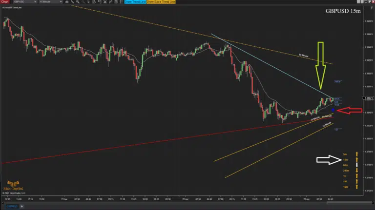 | 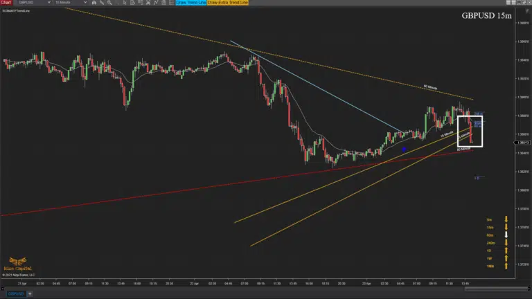 |
Image - 15 (Click to ZOOM) | Image - 16 (Click to ZOOM) |
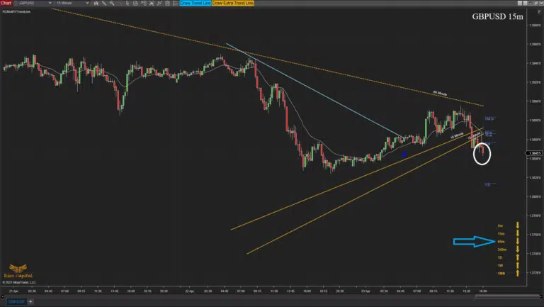 | 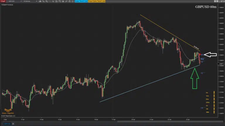 |
Image - 17 (Click to ZOOM) | Image - 18 (Click to ZOOM) |
A downtrend line drawn pointing downward will be broken only when the current market price crosses it from below. When this occurs, the line will change its colour to light blue (indicated by a lime-green down arrow in Image 15), and an up arrow will be plotted to show where the trend line was broken (marked by a red left arrow in Image 15). As soon as the main trend line is broken, the arrow colour in the corresponding timeframe of the ‘Trend Strength Meter’ will change (highlighted by a white right arrow in Image 15).
For an uptrend line, if the market price crosses it from above, the line will be broken, and a red arrow will be plotted to indicate the break. However, if the current market price crosses above or below the additional trend lines (shown within the white rectangle in Image 16), this will not affect the indicator’s results.
Even when viewing a lower timeframe chart, a broken main trend line from a higher timeframe will not be visible on the lower timeframe. In Image 17, a higher timeframe main trend line (previously visible in Image 16) is broken by the current market price (marked by a white circle). Simultaneously, the arrow colour in the corresponding timeframe of the ‘Trend Strength Meter’ changes (indicated by a light-blue right arrow in Image 17). If you switch to the higher timeframe where the trend line was drawn, you will see the broken trend line and an arrow marking the break (shown by a green up arrow and white left arrow in Image 18).
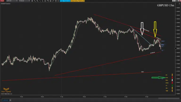 | 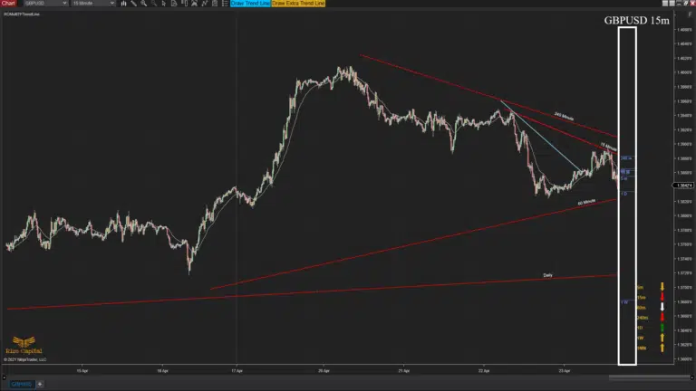 |
Image - 19 (Click to ZOOM) | Image - 20 (Click to ZOOM) |
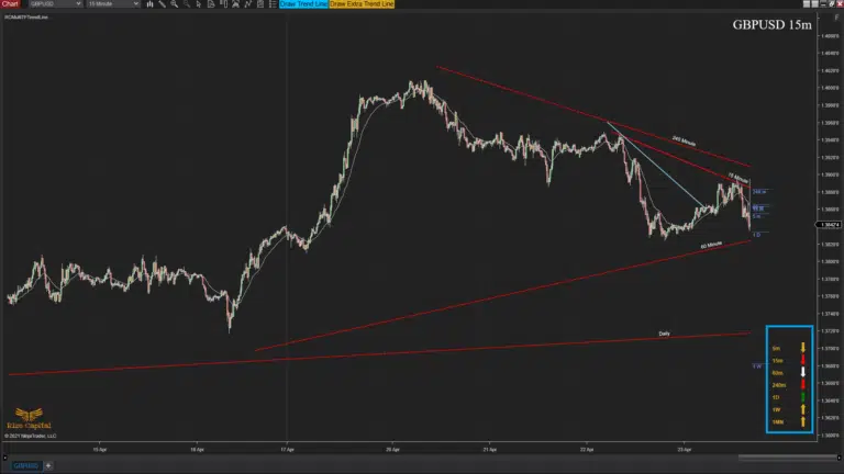 |  |
Image - 21 (Click to ZOOM) | Image - 22 (Click to ZOOM) |
After a main trend line is broken, if no main trend line is drawn on that timeframe’s chart, you can draw a new main trend line that will act normally. In Image 19, a broken trend line is shown on the chart (indicated by a white down arrow). A new main trend line is then drawn (marked by a yellow down arrow), which will act as the current trend line for that specific timeframe’s chart. You can also see the change in arrow colour in the ‘Trend Strength Meter’ (highlighted by a green right arrow in the same image).
We previously discussed the various EMA lines on the right side of the current bar (highlighted by a white rectangle in Image 20). These lines provide a quick overview of short-term EMA-based trends relative to the current timeframe’s EMA trend, offering a snapshot of overall EMA-based market trends across different timeframes. These are also labelled to identify the timeframes they represent.
In Image 21, the ‘Trend Strength Meter’ is highlighted by a light-blue rectangle at the bottom-right corner. Timeframe labels appear on the left, with arrows on the right. These arrows indicate the direction and strength of the current trend for their respective timeframes. As noted earlier, the arrow colour is linked to the main trend line you’ve drawn on that timeframe’s chart; any changes to the trend line affect the arrow’s colour. To interpret the market trend:
- Up or down arrow simply represents up or down trends.
- A golden arrow means no specific trend (no main trend line drawn), showing the market’s bias toward the arrow’s direction.
- A white arrow indicates a trend in development, but it lacks strength.
- A red arrow signals a strong downtrend.
- A green arrow signals a strong uptrend.
The more arrows showing similar red or green colours, the stronger the overall trend in that direction.
The indicator currently supports 5-minute, 15-minute, hourly, 4-hourly, daily, weekly, and monthly timeframes’ charts. Your current chart’s timeframe is plotted at the top-right corner (marked by a pink up arrow in Image 22). If you are on a chart that's not specified above, a text message will appear on the chart (indicated by a white down arrow in Image 22), prompting you to adjust the timeframe.
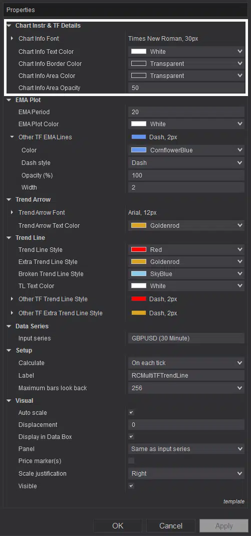 | 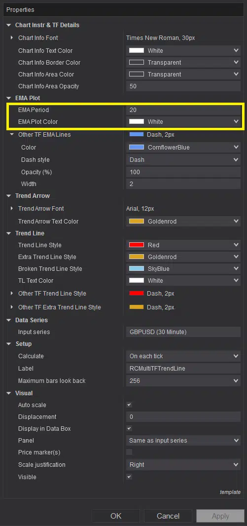 | 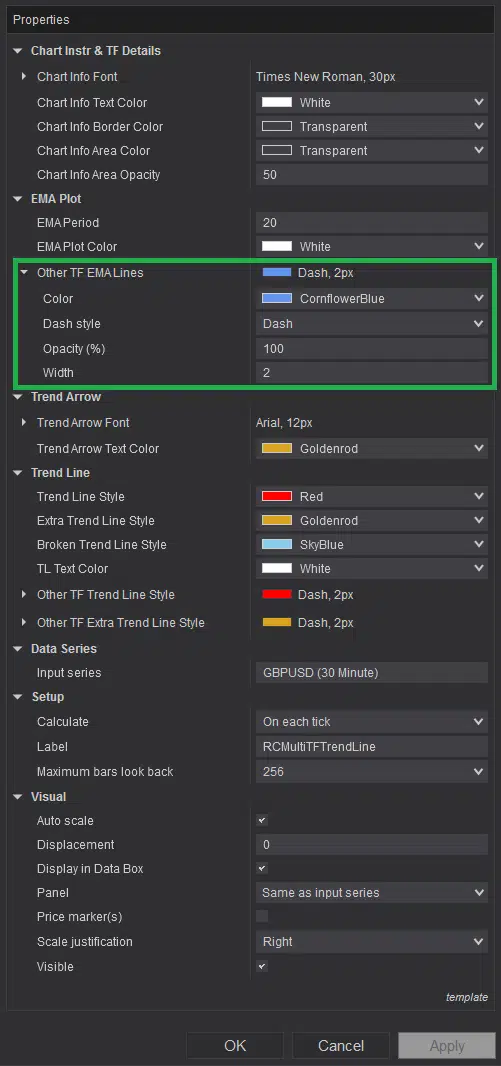 |
Image - 23 (Click to ZOOM) | Image - 24 (Click to ZOOM) | Image - 25 (Click to ZOOM) |
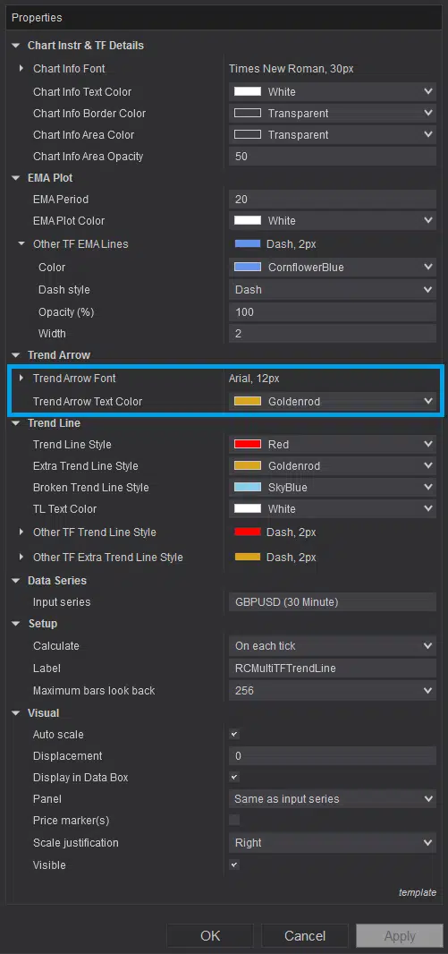 | 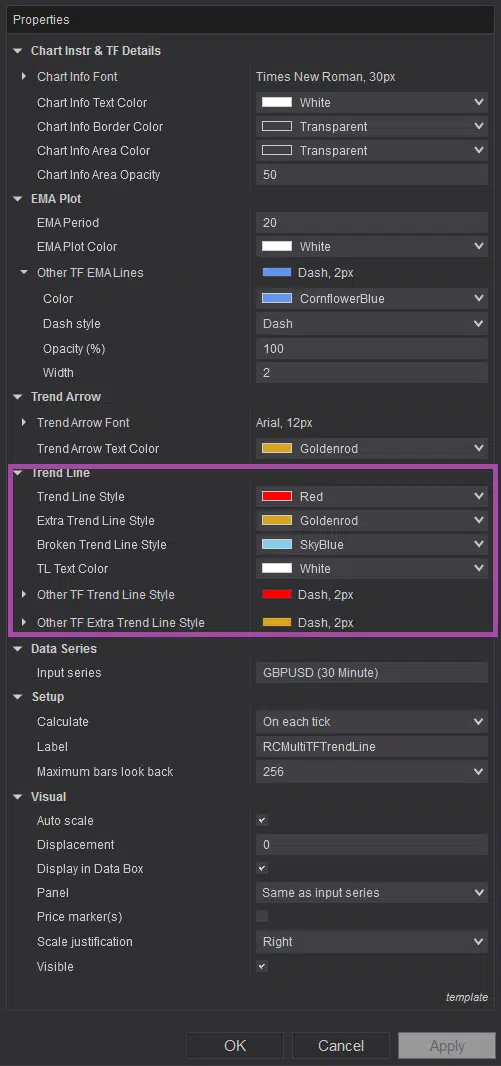 | 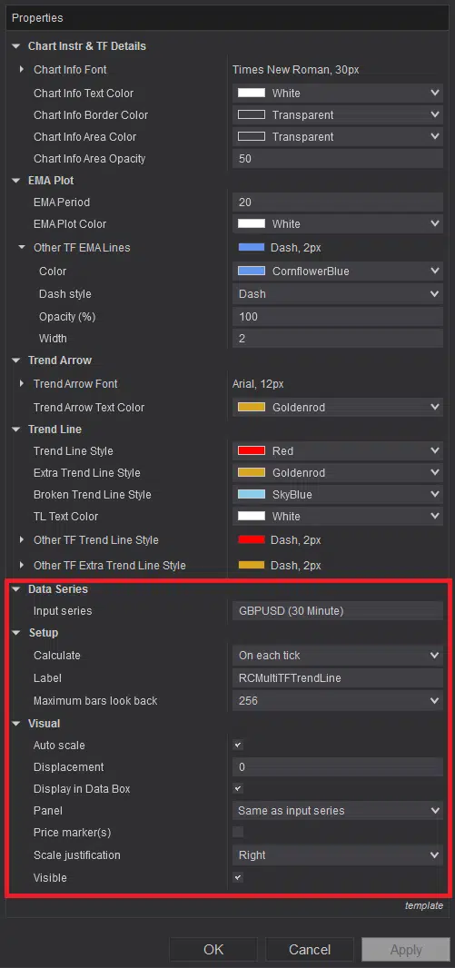 |
Image - 26 (Click to ZOOM) | Image - 27 (Click to ZOOM) | Image - 28 (Click to ZOOM) |
You can customise the chart’s instrument name and timeframe plot colour (indicated by the pink up arrow in Image 22) via the indicator’s settings parameters within the white rectangle in Image 23. To modify the current timeframe’s EMA plot (marked by a yellow down arrow in Image 2) colour or its period, adjust the settings parameters within the yellow rectangle in Image 24. To change other timeframes’ EMA plot colours (highlighted by a white rectangle in Image 20), use the parameters within the green rectangle in Image 25. To adjust the text colour of the ‘Trend Strength Meter’ timeframe labels (highlighted by a light-blue rectangle in Image 21), modify the parameters within the light-blue rectangle in Image 26. To customise the plot colours of the main, extra, and other timeframes’ trend lines and their associated labels, use the parameters within the purple rectangle in Image 27. Avoid altering parameters highlighted within the red rectangle in Image 28 to ensure the indicator’s effective and accurate operation.
If you still have any further queries, please do watch the video tutorial by clicking here.

Rize Capital Ltd is an independent NinjaTrader vendor and affiliate. We may earn a commission if you register through our NinjaTrader referral link. Trading carries risk. Always trade responsibly.
Was this article helpful?
That’s Great!
Thank you for your feedback
Sorry! We couldn't be helpful
Thank you for your feedback
Feedback sent
We appreciate your effort and will try to fix the article